First look at the new Twitter Web interface - Facebookification
Posted by Ahsan Tasneem | 11:31 AM | Social Media, social network, Twitter | 0 comments »Take a first look at the new Twitter web interface. Here's what we love, dislike and want more of from the redesigned site.
On Tuesday, Twitter announced major changes to the way users can interact with its Web interface. It is nothing short of a total multimedia makeover. The new Twitter means a better, more enjoyable user experience for users. There’s more to see, more to do and more to engage with, without having to leave Twitter.The new Twitter will be rolled out slowly over the next few weeks to all users, but today we can show you exactly what that looks like, as reported by Wired.
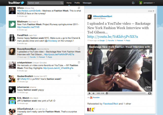
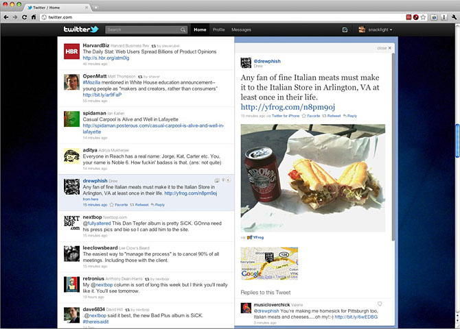
Now tweets can be expanded upon in a second column that opens up next to a users Twitter stream. That will display rich multimedia content, from videos (as shown above) to pictures and their location on a map (as shown below).
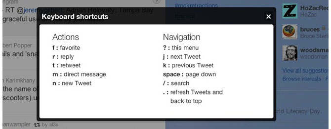
Not only is this a multimedia makeover, but Twitter is positioning itself to act more like a desktop application. Case in point, the new Twitter incorporates a fancy set of keyboard shortcuts. This is going to be a hot feature for Twitter power users who no longer need to be slowed down by interacting with a mouse. For anyone that has ever used the keyboard shortcuts in Gmail, you know what a coveted features this is.
These changes will undoubtedly reframe the landscape and competitive nature of third-party Twitter applications, now that many of their cutting-edge features are included within Twitter’s Web interface.
The new Twitter interface is also a step in the right direction for companies that are looking to advertise. With content embedded in the Web interface, getting a customer or fan to click on the link should be easier since it no longer involves being directed to a new site.
So what are the drawbacks? Although more user-friendly, Twitter still doesn’t provide analytics to users. It also doesn’t provide conversation threads or nestings of tweets between users. We’d expect to see these features crop up sometime in the near future.
Overall this is a major improvement for users, businesses and information junkies who will soon be able to maximize their experience with Twitter. What do you think of the redesign?
I'll be posting all the latest updates on it ... keep following @ahsantasneem
Subscribe to:
Post Comments (Atom)


0 comments
Post a Comment